013
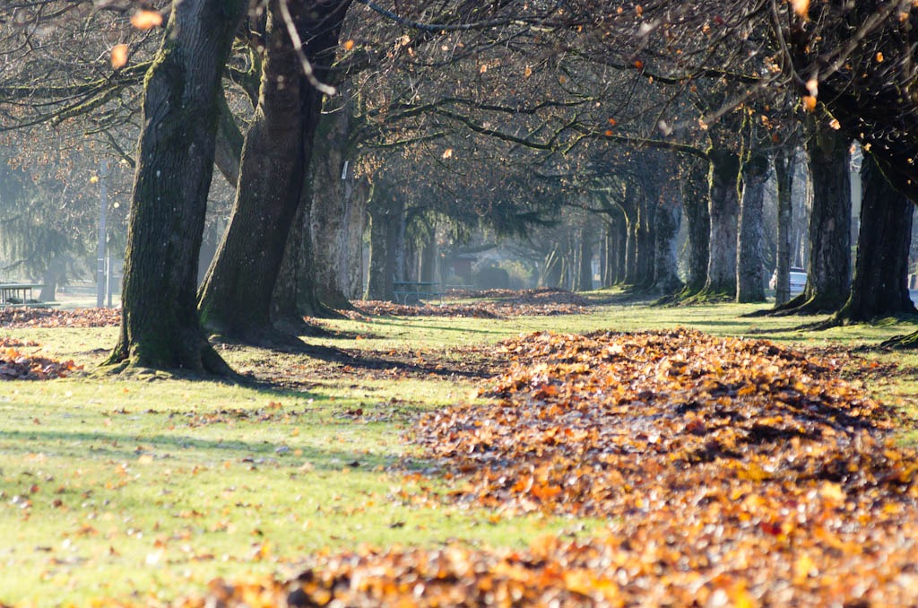
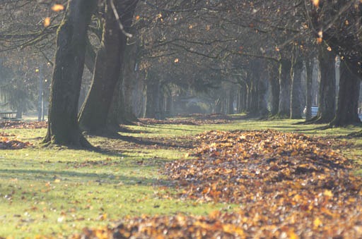
These are the same pictures, just edited for exposure and levels. Below is unprocessed; above was quickly done in Lightroom.
I like this picture. It isn’t brilliant, but it seems to demonstrate my taste for mirrors. The lower half has big swaths of green and orange with some texture but not a ton of local contrast. The upper half has little bits of green and orange, but lots of local contrast among the tree branches.The out-of-focus leaves in the lower-right (which was not intentional, by the way; reading the focus off one of those screens in bright light is difficult) really pushes my eye back into the rest of the picture. The lower left is so boring as to be not attractive at all, were it not for the green lines leading straight to it from the left border and the center of the image. The boring green “n”, actually, works very well as negative space.
And, as I look at it, the park bench on the left and the visible car balance each other. I happen to be vaguely proud of my eye’s ability to compose without my brain really getting excited until after the fact.
This was a not-so-good morning. Car was broken into over the weekend, which we found out about this morning. Then, I was running late and—since I was literally running, which I never do, and since I was wearing my dress shoes with hard plastic heel taps—I managed to miss my bus because I tweaked my ankle on my way to it. Anyhow. Ended up with an extra 20-odd minutes, so I hobbled down the bus route and found myself waiting on the other side of the street from the park.
Nice park. I had my F70-210/4-5.6 with me and decided to play around. The sun was literally above and to the left of the visible frame. (This was taken at f/6.7, 180mm, without a hood.) I really expected to open up my computer and find that it was totally washed out. The picture was washed out, but not totally.
In Lightroom, to bring the brights up to white, increase the exposure; to take the lowest values down to black, adjust the “Blacks” slider. I like having my images span almost the entire range. To muck about with grays, use the Tone Curve. I normally adjust using levels, but that doesn’t seem to be available. One of the joys of learning Adobe products, I suppose.
Anyhow, I have some catching up to do. To be on schedule with photo-a-day, I’d need to add 17 pictures in the next week. Might happen. Might not. I’m not going to worry about it, but rather I’ll post pictures when I get ones that are worth sharing.

